Modification To Our Logo Design

  • Status: Closed
  • Prize: $81
  • Entries Received: 126
  • Winner: tarikulislam86

Contest Brief

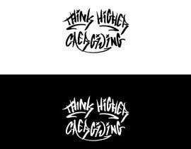
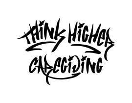
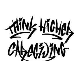
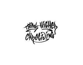
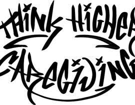
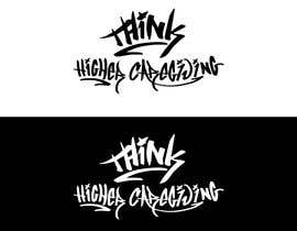
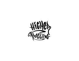
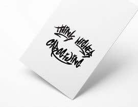
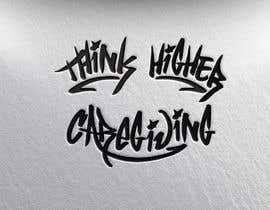
We are looking to get one of our designs adjusted to flow better. Specfically we are looking to get the "Higher Caregiving" portion adjusted to better match the "Think".

When viewing Think Higher Caregiving in large, you will notice handfuls of details that differ between the first word "Think" & "Higher Caregiving". We love the "Think" and need "Higher Caregiving" to match exactly.

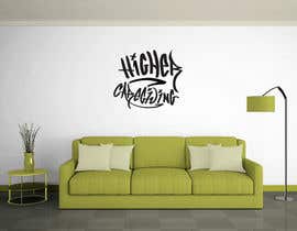
I have included multiple files, in addition to a mock-up of it placed on a garage door, as we believe it brings out the disrupted flow, thickness, and flow of lettering. The adjustments should be done solely to "Higher Caregiving"

DO NOT adjust the "Think" at all, please.

Recommended Skills

Top entries from this contest

View More Entries

Public Clarification Board

  • Logobari
    Logobari
    • 3 years ago

    Please check #175

    • 3 years ago
  • Logobari
    Logobari
    • 3 years ago

    Please check my entry #175

    • 3 years ago
  • MuhammadNabilSh
    MuhammadNabilSh
    • 3 years ago

    Please check #173 I've redesigned the letters mainly to conform to the word THINK and added some ligatures hope you like them. I'd like to know your opinion and tell me whichever modifications you want.

    • 3 years ago
  • Haidar2012
    Haidar2012
    • 3 years ago

    Hello, please check my design #145 , #146 , #147 , #148 and give me feed back and If you need any change please inform me.Design available in 100% editable. Thank you.

    • 3 years ago
  • Haidar2012
    Haidar2012
    • 3 years ago

    Hello, please check my design #145 , #146 , #147 , #148 and give me feed back and If you need any change please inform me.Design available in 100% editable. Thank you.

    • 3 years ago
  • designhunter007
    designhunter007
    • 3 years ago

    please check my idea #120 #121 #122 #123

    • 3 years ago
  • mizanur1987
    mizanur1987
    • 3 years ago

    please check #109

    • 3 years ago
  • ThinkHigherMT
    Contest Holder
    • 3 years ago

    We need to see adjustments to the R in Higher and Caregiving. Remember how bold the lettering is matters. Everyone has done a good job but no one has been able to copy the Think style fully as of yet.

    We will be extending the contest. Please let us know if you have any questions.

    • 3 years ago
    1. kawsarali3517
      kawsarali3517
      • 3 years ago

      Please check #99 and tell me if what you want to change

      • 3 years ago
    2. HA2Design
      HA2Design
      • 3 years ago

      can you check #61 please

      • 3 years ago
  • kawsarali3517
    kawsarali3517
    • 3 years ago

    Please check my new entry #103

    • 3 years ago
  • jueal520
    jueal520
    • 3 years ago

    check my entry plz #96 #95

    • 3 years ago
  • kawsarali3517
    kawsarali3517
    • 3 years ago

    Please check my new entry #98 , #99

    • 3 years ago
  • mizanur1987
    mizanur1987
    • 3 years ago

    Please check #87

    • 3 years ago
  • MuhammadNabilSh
    MuhammadNabilSh
    • 3 years ago

    I have gone through every stoke of the "HIGHER CAREGIVING" considering "THINK" as my reference and described the modifications in detail. Please check #86

    • 3 years ago
  • Nomi794
    Nomi794
    • 3 years ago

    Please check #76

    • 3 years ago
  • ThinkHigherMT
    Contest Holder
    • 3 years ago

    Again, only the "Higher Caregiving" portion modified. We want it to MIMIC the "Think". Please do not just apply bold to the wording or simple aspects & DO NOT modify the sizing or layout of the words. You have to adjust lines, points, & arching of the words to match "Think"

    • 3 years ago
    1. rocksunny395
      rocksunny395
      • 3 years ago

      check #29 .its fulfilled your comment description. iff need any changes you can drop a message or option the chat option and come to private chat !

      • 3 years ago
    2. aqeelahmed8124
      aqeelahmed8124
      • 3 years ago

      have a look on #75 please and let me know if you need more changing

      • 3 years ago
  • aqeelahmed8124
    aqeelahmed8124
    • 3 years ago

    check #75 please

    • 3 years ago
  • yassersaeed2020
    yassersaeed2020
    • 3 years ago

    please check #36

    • 3 years ago
  • yassersaeed2020
    yassersaeed2020
    • 3 years ago

    please check #35

    • 3 years ago
  • rocksunny395
    rocksunny395
    • 3 years ago

    check entry #29

    • 3 years ago

Show more comments

How to get started with contests

  • Post your contest

    Post Your Contest Quick and easy

  • Get tons of entries

    Get Tons of Entries From around the world

  • Award the best entry

    Award the best entry Download the files - Easy!

Post a Contest Now or Join us Today!