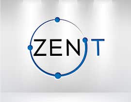
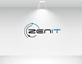
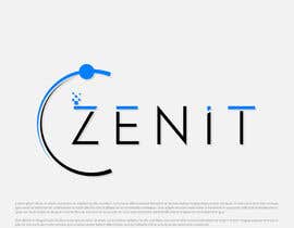
Logo reDesign for IT company
- Status: Closed
- Prize: €250
- Entries Received: 1887
- Winner: HASINALOGO
Contest Brief
Dear Freelancers! Thank you for reading our project!
I'm posting the current logo. The company name is ZENIT coming from the word: Zenith
Meanings:
1.) The time at which something is most powerful or successful.
2.) The point in the sky or celestial sphere directly above an observer.
Also, it would be nice to somehow use the ending IT - since it is an IT company.
About the company:
The company is an IT company, whose main focuses are: programming, cyber-security, and network development.
Colors preferred: blue, silver, grey, black.
The logo must be on a lot of accessories we will be using it on pens, pins ( so it should be easy to use in a miniature version ), and other bigger marketing materials. A logo is not effective if it loses too much definition when scaled down for letterheads, envelopes, and small promotional items. The logo also has to look good when used for larger formats, such as posters, billboards, and electronic formats such as TV and the Web.
We would like a simple, clean and if it is possible clever logo.
Our business is 100% business to business the logo has to reflect a professional clean look.
The Goal IS Recognition, an easy-to-remember logo would be the best pick for us.
Thank you very much for reading through our project!
Recommended Skills
Employer Feedback
“Perfect logo design, thank you!”
![]() miklskacskovics, Hungary.
miklskacskovics, Hungary.
Top entries from this contest
-
HASINALOGO Bangladesh
-
bimalchakrabarty Bangladesh
-
bimalchakrabarty Bangladesh
-
naimdesigns7 Bangladesh
-
naimdesigns7 Bangladesh
-
soponroy0099 Bangladesh
-
raphaelarkiny Brazil
-
raphaelarkiny Brazil
-
raphaelarkiny Brazil
-
raphaelarkiny Brazil
-
raphaelarkiny Brazil
-
raphaelarkiny Brazil
-
mstangura99 Bangladesh
-
begumbilkis444 Bangladesh
-
bimalchakrabarty Bangladesh
-
Jahid896 Bangladesh
Public Clarification Board
How to get started with contests
-

Post Your Contest Quick and easy
-

Get Tons of Entries From around the world
-

Award the best entry Download the files - Easy!


