
graphicpro99
Bangladesh
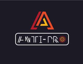
Hi Guys, thank you so much for having participated to this contest. I've really appreciated several logos, at the same time just one of yours will be selected. I did a poll through my friends and the majority of them pointed me to the #317 made by @Niranjan.
thank you again everyone
ciao!
You are welcome sir.You choose best one.
PLEASE CHECK: #369
PLEASE CHECK: #368
PLEASE CHECK: #366
PLEASE CHECK: #365
#348 is a clear copy of my logo
Please check #330 Thanks!
Please check #327
Please check #322, #323, #324, #326, thanks
#318
#316
#310
please check my new entry
please check entry #237
#212 #213 #214
#169
Please check #174
#173
#169 I am available for unlimited revise until you feel satisfied with my work. I hope i can give you the best logo
Hi guys
I saw many of you displaing logos on a business card or like on a paper card... please don't do it. let's consider the logo will be used mainly online and I need to see it clearly on the screen. So, please no printed effect on paper, but just the plain logo...
#154
Please check #150
Please check #148
#143
Please check #140
Please check #127, #132, #133, #137, thanks
Please check #127
please see entry #88
check #87
#82
#74
#60
#58
Please check #57
please check #43
Check #50
helo
Check #47
Please guys focus on the logo without the full text "Anti-Pro" inside. As I said, try to use an abstract or figurative element (like fire, sword, a Polygon, whatever you think is proper to be a flag for young boys). Some of you already got it... many others are still making the logo with the full text.
Please ask me if not clear ;)

check this please #33
Sir check entry #40. I hope you like this logo.
Please check #17
Thanks Barsa... What I'm not sure is that if we take only the logo (without the text) the colored orange part it's too persistent heavy. Anyway I love simplicity.
Our logo should represent an abstract or figurative element (like fire, sword, a Polygon, whatever you think is proper to be a flag for young boys).
The name itself is better if not included directly in the logo. What I mean is that we should be able to use the logo alone. See the prestonplayz logo I referred in description to have an idea.
thank you guys!


Post Your Contest Quick and easy

Get Tons of Entries From around the world

Award the best entry Download the files - Easy!