Logo Design for Allmightytrader
- Status: Closed
- Prize: $200
- Entries Received: 190
- Winner: andrewdigger


Contest Brief
COMPETITION FOR THE BEST LOGO DESIGNER
Allmightytrader is going through an exciting phase of rebuilding our online platform to become one of the leading players in online trading. We are an Internet Intermediary, similar to Amazon.com, that facilitates transactions between third party businesses and consumers. As part of our rebuilding process, we need a talented designer to create our new company logo.
If you are someone with great ideas and fine design skills, this is a great opportunity to be associated with what may become one of the world's most recognised logos.
To enter this competition, here are the instructions:
1. Visit http://www.allmightytrader.com/newsite/site/. This link give you an idea of what our new online platform will look like. The logo that you design will replace the one that is currently at the top left of this page. Your logo will need to demonstrate continuity with the rest of the website.
2. Where possible, please attempt to visually integrate our company's vision and mission to your logo design. Allmightytrader's vision and mission statements are provided below.
3. A modern logo should also have a distinct part that is scalable to a small square to ensure that it can also function as a mobile app icon.
4. We believe that a best logo should be simple, modern, stylish and distinctive. These will be our selection criteria.
VISION
To be recognized as a respected and committed business partner bringing innovation, providing opportunities through cutting edge technologies and inspired ideas, uniting a world of trade where business and consumer can benefit from the cost effective platform and the wide variety of products and services on offer. We will bring the world to each country we enter.
MISSION STATEMENT
Allmightytrader mission is to provide a global trading platform that brings the best products and services from around the world to our customers. Providing and listing a broad range of discounted products and services from third parties with a market focus on quality, price and service intended to meet the requirements of our business and consumer customers on all levels. Our principal competitive edge will be our intermediary position of not carrying, shipping, or producing the product or service, having no boundaries or limitations. We plan to grow the business by using the large global market potential and the opportunities for growth between the buyer, sellers and firms. Our sustainable uniqueness will distinguish our business from others on a long-term basis
This contest will run for 10 days. We look forward to seeing some amazing designs come to life.
GOOD LUCK!
"We are only limited by our imagination" - Anon
Recommended Skills
Employer Feedback
“@andrewdigger won the contest on 8 May 2013”
![]() rywjin, Australia.
rywjin, Australia.
Public Clarification Board
-

andrewdigger
- 11 years ago
What is the final feedback?
- 11 years ago
-

XandeAlves2000
- 11 years ago
Please check and rate #103 .
- 11 years ago
-
XandeAlves2000
- 11 years ago
- 11 years ago
-

Hallstar1984
- 11 years ago
#249, #248 please
- 11 years ago
-

sultandesign
- 11 years ago
Please check my design #220 #222 and #221 thanks
- 11 years ago
-
sultandesign
- 11 years ago
Please check my design #220 #222 and #221 thanks
- 11 years ago
-

smarttaste
- 11 years ago
*********************************** #246
- 11 years ago
-
Aakashbansal32
- 11 years ago
- 11 years ago
View 1 more message
-
Aakashbansal32
- 11 years ago
- 11 years ago
-
Aakashbansal32
- 11 years ago
- 11 years ago
-
Aakashbansal32
- 11 years ago
#239
Icon is not funny, take it seriously- 11 years ago
-

designerasse
- 11 years ago
Plz Feedback #231 #232
- 11 years ago
-

rashedhannan
- 11 years ago
- 11 years ago
-
rashedhannan
- 11 years ago
- 11 years ago
-
rashedhannan
- 11 years ago
check #202
- 11 years ago
-
rashedhannan
- 11 years ago
- 11 years ago
-
rashedhannan
- 11 years ago
- 11 years ago
-

oscarhawkins
- 11 years ago
please see #191 #192 and #193 and check PM thank you
- 11 years ago
-

paxslg
- 11 years ago
#187..please check..thank you.
- 11 years ago
-

vineshshrungare
- 11 years ago
please check #184 #185 thanks..
- 11 years ago
-
oscarhawkins
- 11 years ago
and #182 .. thank you :)
- 11 years ago
-
oscarhawkins
- 11 years ago
please check #179 and #180 feedback appreciated
- 11 years ago
-

FreeLander01
- 11 years ago
#171 Please Chek
- 11 years ago
-
FreeLander01
- 11 years ago
- 11 years ago
-
oscarhawkins
- 11 years ago
Here is my Superhero concept #152 as ? can develop and tweak according feedback.. thank you :)
- 11 years ago
-
vineshshrungare
- 11 years ago
please check #147 thanks
- 11 years ago
-
vineshshrungare
- 11 years ago
see the concept of logo, beedback me.!...so i will be back with some colour combination
- 11 years ago
-

rahultopno
- 11 years ago
Greetings! Please check out #146 ! Thanks!
- 11 years ago
-
jafferali110
- 11 years ago
Please check #134 Thanks. feedback me about my entries.
- 11 years ago
-

premgd1
- 11 years ago
and #128 . Thanks
- 11 years ago
-
premgd1
- 11 years ago
Hi! Please rate my design #126 . Thank you.
- 11 years ago
-
FreeLander01
- 11 years ago
#122 Please Check
- 11 years ago
-

Designer0713
- 11 years ago
Hi! Please see my design #119 Thanks a lot! :)
- 11 years ago
-

whitecat26
- 11 years ago
Pls. feedback for #93
- 11 years ago
-
rahultopno
- 11 years ago
Hello Contest Holder! Thank you for your feedback. please check out #85 . Thanks!
- 11 years ago
-
rahultopno
- 11 years ago
correction #87
- 11 years ago
-
jafferali110
- 11 years ago
hi, please check new entry #73 kindly give some feed back. thanks
- 11 years ago
-
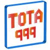
tota999
- 11 years ago
Hi! Anon!!!
I've added two more design. I think my logo represent your business themes. So, please see the design and feedback also.
Thanking
Tota- 11 years ago
-
tota999
- 11 years ago
About the design....
1. The shopping cart indicates your business type.
2. The colorful cart objects are the symbol of variety of business.
3. The raising GREEN arrow shows the productivity and up-growing business.
4. The font type and color match with your business as your products are nice, stylish, variety.
5. The shadow below the "allmightytrader" for smoothness of your business.
6. The .com is for your domain extension.
Thanks
tota999- 11 years ago
-

Contest Holder - 11 years ago
Note: We do not tolerate imitated or copied designs.
- 11 years ago
-
Contest Holder - 11 years ago
Hi all participants, we are very excited by the number of brilliant designs that we have seen. If you received a low rating, please don't be discouraged. It is based on the suitability of design to what we are looking for, it does not mean that your design was not good. We encourage you to have a look at which logos received higher ratings.
IMPORTANT: We have seen a lot of designs that incorporate a shopping cart or a business briefcase into the logo. However, we encourage you to come up with a design that can represent both the consumer and business elements of our website. As for tips, we are a company that has great search-ability (you can find products and services from all over the world), both for regular consumers and businesses. We are also a company that has immense scope (you can find a very large variety of products and services). Hope this helps.
Thank you to all the participants. Please continue your amazing designs!- 11 years ago
-

sarahafiz
- 11 years ago
hi... pls check & comment # 54
- 11 years ago
-
Contest Holder - 11 years ago
Very catchy and easy to remember. But the team felt that the design has a somewhat 'old' feel to it. We feel that this could be either because of the red arrow or the typography. However, we love the simplicity. We are hoping that this could be further improved.
- 11 years ago
-

umamaheswararao3
- 11 years ago
Please check and feedback on #56 , #57 , thank you!
- 11 years ago
-
Contest Holder - 11 years ago
Hi, I hope you are not discouraged by our rating. We genuinely thought that your design was nice. The only issue was that it had a very corporate feel to it, which doesn't work for us since we are also a consumer focused company. I feel that your logo could be improved and result in something very good.
- 11 years ago
-
rahultopno
- 11 years ago
Hi! The logo I designed shows the continuity of your website and cleverly shows the varied business products through the colours. feedback would be appreciated!
- 11 years ago
-
Contest Holder - 11 years ago
Hi, I like your idea of using the colourful background. My feedback for as of now would be: 1) there are too many colours in the background, it's almost confusing and not very pleasing to look at; 2) the choice of typography could be greatly improved. I would like to refer you to the logos for ebay and amazon. We expect something to that level.
- 11 years ago
-
rahultopno
- 11 years ago
- 11 years ago
-
rahultopno
- 11 years ago
- 11 years ago
-
tota999
- 11 years ago
Hi!
Check the #13 and reply...
Thanks- 11 years ago
How to get started with contests
-

Post Your Contest Quick and easy
-

Get Tons of Entries From around the world
-

Award the best entry Download the files - Easy!