gerardguangco
Philippines

I already have a logo that I made myself, though I would like it to look betterl.
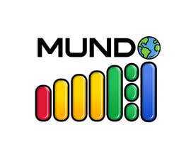
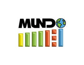
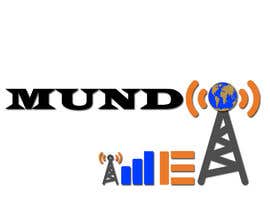
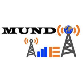
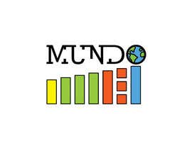
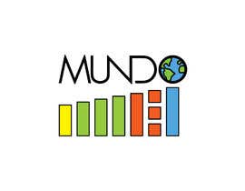
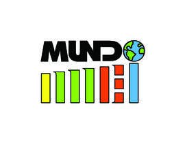
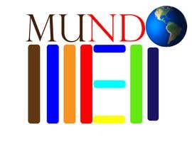
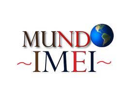
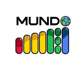
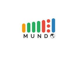
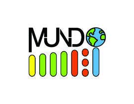
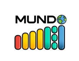
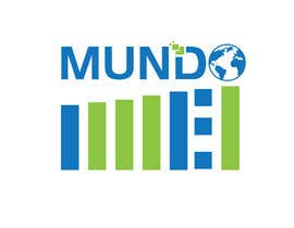
It's made of two words. The one at the top (MUNDO) means "world" so that's why it has an earth globe instead of "O"; and the other word below (IMEI) is related to cellphones, that's why the letters resemble cellphone signal bars.
I would like to keep the same idea, with the same 2 words but more stylish and more professional, though I'm not closed to other suggestions.
The .psd and transparent .png will be requested.
I will mostly choose the winner by taste and style of the logo, regardless of the contestants' experiencie, so it doesn't matter if you're new, feel free to submit your work, you may even win ;)
I won't forget to give a positive feedback after the job is done, because I understand the importance of it.
Thanks for seeing my ad, have an excellent day =D


Post Your Contest Quick and easy

Get Tons of Entries From around the world

Award the best entry Download the files - Easy!