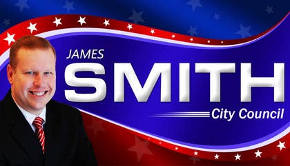
Graphic Design for James Smith for City Council
- Status: Closed
- Prize: $100
- Entries Received: 1
- Winner: debdas0278

Contest Brief
Political Campaign
Recommended Skills
Employer Feedback
“Details were followed closely, communication was easy and the transfer of the work was seamless. An additional version of the project was added after being chose winner, which really benefited us. Thank you for your work on our project. We will use you again in the future. ”
![]() jmzsmith, United States.
jmzsmith, United States.
Public Clarification Board
-

ykumar85
- 11 years ago
Kindly give your valuable feedback on my #114, #115, #116 entries...
- 11 years ago
-

annie28
- 11 years ago
#113 please provide feedback on the same. Thanks!
- 11 years ago
-
annie28
- 11 years ago
I have a design, ready to serve in 30 mins!
- 11 years ago
-

Ferrignoadv
- 11 years ago
#79 #80
as you requested
Best regards- 11 years ago
-

Qomar
- 11 years ago
#77, thanks....
- 11 years ago
-

dothanhliem
- 11 years ago
kindly to review #73 #74 #75 #76
many thanks!- 11 years ago
-
fasdesign
- 11 years ago
Hi jmzsmith I uploaded 2 more designs please check #54,#70 and give me feedback.
- 11 years ago
-

Oscartic
- 11 years ago
Hi, please check #69, Thanks
- 11 years ago
-

aliartdesign
- 11 years ago
hi , please check #68 ,, thank you
- 11 years ago
-

debdas0278
- 11 years ago
please check my entry #44, #47 and #67
- 11 years ago
-

Linkonbd
- 11 years ago
Please check #63, #65, #66
- 11 years ago
-
Linkonbd
- 11 years ago
Please check #63, #65
- 11 years ago
-
Ferrignoadv
- 11 years ago
#60 #61
new versions with photos and test shades.
Best regards
FerrignoAdv- 11 years ago
-

Ollive
- 11 years ago
Hi, please check #31 #32, Thanks
- 11 years ago
-

Contest Holder - 11 years ago
The word "SMITH" must big bigger and more prominent in the design. Thank you!!! Maybe more shadowing effects..not too much.
- 11 years ago
-
Ollive
- 11 years ago
Hi please check my new design #57 Thanks!
- 11 years ago
-
Ferrignoadv
- 11 years ago
17# #16 can you please give me feedback on my proposals?
Best regards- 11 years ago
-
Contest Holder - 11 years ago
I like your design. Good use of shadowing, shine/reflections and wave in the background. The word "SMITH" is dominant, which is good. You are the leader at this point. Could you incorporate the shade of red/blue from entry #25? I wish your design incorporated enough space for some of the photo, but may be tough on your design.
- 11 years ago
-
Ferrignoadv
- 11 years ago
ok, tnks
- 11 years ago
-

pajadt
- 11 years ago
Pa dje ovde zapelo, covek oche u gradsku vladu, oce plakat za sto dolara jest bre stipsa zivi u amerki
- 11 years ago
-

WebofPixels
- 11 years ago
Hi, could I get feedback on #33 and #34 please. Note: #35 is only to be regarded as a possible timeline image.
- 11 years ago
-
Contest Holder - 11 years ago
I like your design, but wish yours had more shadowing, fading, curves ect...seems kind of flat.
- 11 years ago
-
WebofPixels
- 11 years ago
Thanks for the feedback. I went for the flatter approach because there can be a number of printing issues when printing large scale gradients. They look great on a screen but sometimes terrible in print.
- 11 years ago
-

jooartz
- 11 years ago
How is it #39 ?
- 11 years ago
-
johnvjs
- 11 years ago
#27 & #28.. Tried without pic.. incorporated stars and stripes into the design itself.. The alignment alone can be used in print media.. Cheers..
- 11 years ago
-
Contest Holder - 11 years ago
Could you add the word "City" to City Council? I like the design of the name in #28 and the ribbon and photo in #27
- 11 years ago
-

A10 Design Pros
- 11 years ago
hello please check entry #37 for once..thanks
- 11 years ago
-

abhishek24
- 11 years ago
Feedback on #36, please! :)
- 11 years ago
-

wik2kassa
- 11 years ago
Hi, Hope you like my entry #26. I've also sent you a Personal Message.
Thanks.- 11 years ago
-
johnvjs
- 11 years ago
#3 FB Timeline
- 11 years ago
-
Contest Holder - 11 years ago
Did you withdraw?
- 11 years ago
-
johnvjs
- 11 years ago
Yes i made #5 & #6.. Apologies..
- 11 years ago
-
fasdesign
- 11 years ago
Hi, Check my design #7 & #8 give me feedback.
Thanks.- 11 years ago
-
Contest Holder - 11 years ago
Hi and thank you for your submission. The ribbon is simply too much. Although I don't think I would use the background, I do like a textured background.
- 11 years ago
-
Contest Holder - 11 years ago
Thank you for your help!
- 11 years ago
-
johnvjs
- 11 years ago
#5 
- 11 years ago
-
Contest Holder - 11 years ago
Your design is in the hunt....the word, "JAMES" can be smaller, the white edge around the head of the subject could be eliminated and the word, "council" slightly enlarged. Could the photo be slightly enlarged at the same time?
- 11 years ago
-
Contest Holder - 11 years ago
These thoughts were for #5, I like that you also submitted a timeline graphic as well. Thank you!
- 11 years ago
-
Contest Holder - 11 years ago
Hi and thank you for your submissions. A couple of thoughts. The use of the actual USA Flag is okay, but not for backdrop of the whole or majority of the image. The use of other colors (besides red/white/blue) should be very limited. The dimensions are not exact, but should be of a size that will allow the image to be used for typical (lke in my examples) rectangular yard signs and blown up to a billboard, if needed. The use the the word "FOR" is optional.
I like the stripes in the background on #1, but #5 is the best so far.- 11 years ago
-

Jazztine
- 11 years ago
any feedback in #10
- 11 years ago
-

JarellH
- 11 years ago
What exact type of design are you asking for? What are the dimensions? etc... Thank You
- 11 years ago
How to get started with contests
-

Post Your Contest Quick and easy
-

Get Tons of Entries From around the world
-

Award the best entry Download the files - Easy!