Facebook Cover Photo Design
- Status: Closed
- Prize: $50
- Entries Received: 147
- Winner: Roy2P
Public Clarification Board
-

veectorgraphic
- 2 years ago
check #129 #128 for quality design as per your instruction
- 2 years ago
-

Almasud1196
- 2 years ago
please check #134
- 2 years ago
-

Tufat180
- 2 years ago
PLEASE CHECK #130 HOPE U LIKE THE DESIGN
- 2 years ago
-

zakirhasanGD181
- 2 years ago
#115 Hello,I make a concept for you.It;s totolly unique and fresh.
You can cheak and let me know if you need any changes.
You can contact me on freelancer chat,
My main goal is to serve you.- 2 years ago
-

Contest Holder - 2 years ago
I'm still seeing a lot of social icons, website URLs, and so on on otherwise good designs. This is just a reminder that I don't need any of those things.
- 2 years ago
-

creativecitylg
- 2 years ago
please check #97
- 2 years ago
-

Contest Holder - 2 years ago
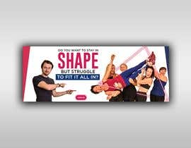
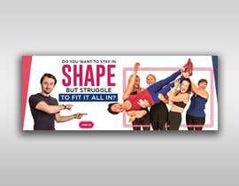
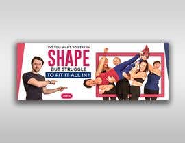
Thanks again. Just a reminder, I'm seeing a LOT of designs where the background is the focal point. The background is exactly that. It should be an afterthought, you should barely notice it.
Look at big brands like Apple or Calvin Klein or something. The focal point is the product, or in the case of, say, perfume or something, the people (the target market) and the message (text/tagline). 9 times out of 10, their billboards are very sparse, often with no background at all, relying on good composition and typography to get their message across.
Here the women are the target market. Ignore the guy, he's the trainer. He needs to be there, but he's not the target market. The man is just the guy pointing to, or holding the iPhone, for example, if this were an Apple ad. The focus is the women, and the tagline calling these women out. Identifying them.
So avoid busy, garish, hugely colourful backgrounds where those things start to blend in.
Think minimalist, stylish, and contemporary.- 2 years ago
View 2 more messages
-

veectorgraphic
- 2 years ago
Any suggestions about my design #18
- 2 years ago
-

sadgirltory3330
- 2 years ago
Tried to give you simple yet modern design..hopefully you will l ike it
- 2 years ago
-

Tufat180
- 2 years ago
please check #95
- 2 years ago
-

Almasud1196
- 2 years ago
please check #90
- 2 years ago
-

zakirhasanGD181
- 2 years ago
#86 Hello,I make a concept for you.It;s totolly unique and fresh.
You can cheak and let me know if you need any changes.
You can contact me on freelancer chat,
My main goal is to serve you.- 2 years ago
-

sanjoykb94
- 2 years ago
Please check #78
- 2 years ago
-

sanjoykb94
- 2 years ago
please check #73 #74
- 2 years ago
-

creativecitylg
- 2 years ago
please rate my work # 63 # 66 # 67
- 2 years ago
-

Contest Holder - 2 years ago
thank you so much everyone that's submitted a concept. From what I've seen so far, I want to give general feedback to help going forward.
The text and the image of the ladies should be the focal point. These are the things pointing out who this page is for. I'm seeing some very colourful, very busy backgrounds, but if the background is busy, it makes it the focus when they should be reading the text.
Think more minimalist.
Also, I don't need any extras. No social icons, or buttons, or anything like that. Those things will take my eye away from your design, because I'll be looking at them.- 2 years ago
-

Contest Holder - 2 years ago
I will do (give individual feedback). I don't do it too early because I don't want to influence people, and then miss out on some great creative ideas! I'll give general feedback in the first 24 hours or so as I learn a lot about what I like and what I don't like, then after that start giving more individual feedback.
- 2 years ago
-

sadgirltory3330
- 2 years ago
That will be great. Hope you enjoy our designs!!
- 2 years ago
-

zakirhasanGD181
- 2 years ago
#52 Hello,I make a concept for you.It;s totolly unique and fresh.
You can cheak and let me know if you need any changes.
You can contact me on freelancer chat,
My main goal is to serve you.- 2 years ago
-

Ghoisanz
- 2 years ago
#47 let's check my second concept
- 2 years ago
-

Sanaullah124
- 2 years ago
Hello sir, I have tried as I can. Please let me know if you want any more customization. Check my entry #1
- 2 years ago
-

creativecitylg
- 2 years ago
I have a question about the photo, do you want a background from a specific site or some background shapes?
- 2 years ago
-

Contest Holder - 2 years ago
No specific site. What you do with the background (even if that's leaving it blank) is up to you.
- 2 years ago
-

Contest Holder - 2 years ago
I've just rejected some, not because they were bad designs, but because they didn't use the photos provided.
- 2 years ago
-

Ghoisanz
- 2 years ago
#8 check my entry please
- 2 years ago
Top entries from this contest
-
abid4design Algeria
-
abid4design Algeria0
-
abid4design Algeria0
-
amin2437 Bangladesh0
How to get started with contests
-

Post Your Contest Quick and easy
-

Get Tons of Entries From around the world
-

Award the best entry Download the files - Easy!


