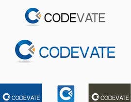
Design a Logo for a software company
- Status: Closed
- Prize: £30
- Entries Received: 208
- Winner: risonsm

Contest Brief
Codevate is a new startup software company; we undertake contractual work with clients, such as web development and mobile applications. More information about us can be found at http://codevate.com, which currently redirects to our old site whilst we are rebranding.
We require a professional looking logo featuring the word 'Codevate'. Some example concept logos are attached, but feel free to be more creative and come up with something completely different. We generally prefer more sleek and minimalistic designs. Codevate is one word, try to avoid using the abbreviation 'CV' as it commonly stands for 'curriculum vitae' and could cause confusion.
At the moment, our main colour is teal (#3AACA8). There is also possibility of using magenta (#7608AA) as a contrasting colour, however these two colours combined in one logo does not seem to work very well. Again, feel free to be creative with the colours - you don't have to stick to these if you have a good idea. Preferably, we would like the logo to look good in both mono (black and white) and colour, so the logo can be used on various articles (letter heads, website, t-shirts, etc). For this same reason, the logo should work well on any background (especially plain black/white).
Submissions should include anything required to repoduce the logo (PSD, fonts, etc.)
You should also have full rights to any fonts or images used in the logo, and agree that the rights to the submission will be transferred to Codevate Limited.
Good luck, we can't wait to see what you come up with!
Recommended Skills
Employer Feedback
“@risonsm won the contest on 27 July 2013”
![]() bennett115, United Kingdom.
bennett115, United Kingdom.
Public Clarification Board
-

nilankohalder
- 10 years ago
nice winning entry
- 10 years ago
-

tenstardesign
- 10 years ago
Hi
- 10 years ago
-

IMExpertSolution
- 10 years ago
HI
- 10 years ago
-
nilankohalder
- 10 years ago
HI
- 10 years ago
-

EssTechnologies
- 10 years ago
Another One...#259...waiting for your feedback....Thank you
- 10 years ago
-
EssTechnologies
- 10 years ago
Please let us know your valuable feedback on...#253 and #256...Thank you.
- 10 years ago
-
nilankohalder
- 10 years ago
I made something clean here: #245 . Do you like it? Please have a say!
- 10 years ago
-
nilankohalder
- 10 years ago
#254 - flat version.
- 10 years ago
-
nilankohalder
- 10 years ago
#255 is my final work, stronger fonts, enhanced look. Hope you like it. ;)
- 10 years ago
-

slobodanmarjanu
- 10 years ago
please send some feedback #198 #199 .......tnx
- 10 years ago
-
IMExpertSolution
- 10 years ago
Hi Contest Holder Please Reviews My 4 Latest Designs
#193 #200 #201 #202
Thank You- 10 years ago
-

kapadia552
- 10 years ago
check #195 ,
#148 logo looks when use as professional:)- 10 years ago
-
kapadia552
- 10 years ago
sir, what about #148 ?
please feedback- 10 years ago
-
agusmasta
- 10 years ago
please check #194 , thanks
- 10 years ago
-
IMExpertSolution
- 10 years ago
Please Check And Reviews #193
ThankYou- 10 years ago
-
IMExpertSolution
- 10 years ago
Please Reviews #188 My Latest Design.
- 10 years ago
-

Contest Holder - 10 years ago
This looks great. Only problem is the capitalization of the 'V', which makes Codevate seem like two words. If you could try the 'V' in lower case that would be great. You could even also try styling the 'V' and 'A' like in #109 #77 #110
- 10 years ago
-
IMExpertSolution
- 10 years ago
Oky For Your Rating . Oky I Will
Thank you- 10 years ago
-
Q2kc
- 10 years ago
Hi CH please see #177 #178 #179 #180 in full view. Thanks
- 10 years ago
-
IMExpertSolution
- 10 years ago
Hello Contest Holder Please Reviews
#176 #175
Thank You- 10 years ago
-

designinvento
- 10 years ago
please check # 88 & 87. Thanks
- 10 years ago
-
IMExpertSolution
- 10 years ago
HM
- 10 years ago
-
KevinChoiKang
- 10 years ago
Please Feedback to #171 Thanks :D
- 10 years ago
-
Contest Holder - 10 years ago
I really like the font in #161, maybe the symbol would look better flat? It could also be worth trying with a symbol like #133 or #109 .
- 10 years ago
-

afqirhh
- 10 years ago
Thank you boss. I saw that CV is for curriculum vitae. That's why
- 10 years ago
-
Contest Holder - 10 years ago
Just to clarify - Codevate is one word, so we're not sure about using the abbreviation 'CV' (especially as it is usually used to stand for curriculum vitae).
- 10 years ago
-
slobodanmarjanu
- 10 years ago
#91 please
- 10 years ago
-
Contest Holder - 10 years ago
#103 I really like the 'bird' symbol, it's just the text that could use some improvement - it can be hard to read, especially when the logo is smaller
- 10 years ago
-
agusmasta
- 10 years ago
#90 , need feedback sir, thanks
- 10 years ago
-
designinvento
- 10 years ago
Please check # 104 & 105.
Thanks- 10 years ago
-
Contest Holder - 10 years ago
Some more feedback:
#52 i like the font - drop the outer grey circle, make the CV in the logo white, join them up
#80 clean looking, good. the logo reminds me of a flower though. it's not really giving a "software vibe"; although it is very cool looking
#79 plain and simple is good, but the "CV" gives off the wrong impression I feel. We're a software company; "CV" is an acronym for "curriculum vitae" and might cause confusion.
#77 really like the VA joining, the O-D isn't so good. the colours are good, and it is simple and minimalistic. good entry!
#71 very cool logo, perhaps make it flat? I like the colours of this and #62 . Perhaps take a leaf out of #77 's book? Thanks- 10 years ago
-

XpertgraphicD
- 10 years ago
Thanks for your valuable feedback.
- 10 years ago
-

allniarra
- 10 years ago
please check #96 , thaks
- 10 years ago
-
Contest Holder - 10 years ago
#87 We prefer this one to the one with the CV logo - the tick looks good. Perhaps try it without the reflection, and maybe use a fixed width font? Perhaps with/without a capital letter for the brand name.
#84 The black to grey gradient looks cool, and the "code" part of the logo looks great! But the final part of the logo is barely readable in that font; looks like "ua?e".
#81 This concept is nice and it looks better on white. The V as a tick is an excellent idea, however it seems a bit large for the rest of the text. In addition, the font seems a bit standard and unspecial.- 10 years ago
-
Contest Holder - 10 years ago
Some more feedback:
#68 The font isn't what we're looking for, and the logo is plain and doesn't give a software development feel; see the feedback for #79 about "CV"
#67 really cool font, doesn't look professional /enough/ - it's getting there though. really like the VA and D.
#65 looks too much like a flower
#61 look likes the coca cola logo - reminds me too much of the matrix
#55 the logo looks kinda like a moon, the font makes it look like the word is Lodevate
#54 good clean design, the logo could do with some rejigging though
#53 we don't really like the logo, and the font is a bit too non-descript- 10 years ago
-

faru011
- 10 years ago
feedback on #61
- 10 years ago
-

Cubina
- 10 years ago
Kindly check #42 too.
- 10 years ago
-
Dudulica2606
- 10 years ago
Please review #39
Thank you- 10 years ago
-
Cubina
- 10 years ago
Kindly check #37
Thank you- 10 years ago
-
KevinChoiKang
- 10 years ago
Please see the full view of #26 and put a feedback on it, thanks :)
- 10 years ago
-
Contest Holder - 10 years ago
Thanks for all of your entries so far. Here's some feedback to help out:
#17 I like what you did with the 'va', it's also nice and simple/crisp
#4 The colours used in the 'orb' look nice, I also like the idea of having a symbol
#6 #7 The idea of the fish (cod) is clever and could potentially work if made to look more professional and less cartoony
Some entries were rejected as they look too similar to WordArt, or just don't work.- 10 years ago
-

rdn1707
- 10 years ago
just posted my entry #11 . let me know if you want any adjustments made to it to better suit your taste
- 10 years ago
-

abishektzotzo
- 10 years ago
- 10 years ago
-

Israfilrahman
- 10 years ago
This type of logo is boring order a colourful logo such as-club penguin's logo
this will attract ur cleints/costomers- 10 years ago
How to get started with contests
-

Post Your Contest Quick and easy
-

Get Tons of Entries From around the world
-

Award the best entry Download the files - Easy!