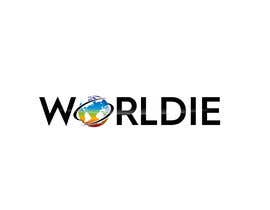
Better Logo for Worldie: Colorful, Modern
- Status: Closed
- Prize: $50
- Entries Received: 65
- Winner: Crea8dezi9e

Contest Brief
Hello, I need Worldie.com's logo to be more colorful with its globe and style (think multicolor/rainbow/gradient), but to keep its current modern, bubble outline feel. Fun and modern.
2 VERSIONS OF LOGOS: 1 for desktop (long), and 1 for mobile (globe with a W)
Keep the current bubble style for the letters, but the front of the logo should have a gradient colored sphere.
- The cell version should be a gradient multi-color sphere with a W in bubble letters on it.
- Should be a black and then a white version of each
- Likely the sphere should not be the same sphere as now!
I am thinking that the Circle/Globe can be multicolor.
This means that you need to create a new circle/globe that is in front....
It should be different colors. It can be gradient...
This is for the desktop version and mobile version for the logo.
The idea is combining the fun multicolors of the past eras (like 90s .com beginnings) such as promoting being different or all-in-one, yet with modernization and fun, as is the positioning of Worldie now.
The circle and globe needs to be original, and only for Worldie. That can be the branding for it.
The W for the mobile version can be solid if needed.
I will run this contest to see if there's an idea on it. The logo should "pop" out from the background preferably.
----
I was unable to post photos from my computer...Please check Worldie.com for the current logo style and youtube.com/c/heromotivators for the example logo that I chose once before.
Recommended Skills
Employer Feedback
“I liked getting different logo versions upon request! That’s beyond what could have been done.”
![]() taftchristina, United States.
taftchristina, United States.
Public Clarification Board

How to get started with contests
-

Post Your Contest Quick and easy
-

Get Tons of Entries From around the world
-

Award the best entry Download the files - Easy!