Take our logo from good to great

  • Status: Closed
  • Prize: $1000
  • Entries Received: 2
  • Winner: chimizy

Contest Brief

We would like to make a significant improvement to our current logo. This job is for highly skilled art directors and creative people. This is not a technical job. We are looking for an effective communication of our brand equity in a refined, yet simple logo that we will fall in love with.

Our selling proposition is:

" With YouCook, you can enjoy cooking great-tasting, healthy and balanced meals every day.
This is because we do all the time-consuming preparations, so you just have to cook and enjoy it.  
-       We choose the recipes from best tasting world-cuisines that are also generously green and nutritionally balanced.
-       We shop for the best quality and responsibly produced ingredients.  
-       We prepare all the ingredients so they are ready to cook.  We vacuum pack them so they stay as fresh as if you just had prepared them. Vegetables are washed&cut, meats are marinated, beans are soaked, sauces are ready to use, etc. 
And because we do all the preparation for you, you can enjoy cooking a great-tasting, healthy and balanced meal in less than 30 minutes.
With YouCook, you can enjoy cooking for you and your loved ones, and serve them great-tasting, healthy and balanced meals everyday. And because you eat more greens, you also contribute to a better world.
YouCook – Because you care!"

Our brand character - or brand equity is:
"YouCook is like the humming bird who tries the put out a forest fire by bringing drops of drops from a near-by lake and pour them over the forest fire. When told that what he was doing was a waste of effort because it would never put out the fire, he replied "I know, but I do my share".
YouCook cares - and does its share - as a regular member of the community (not a president, professor, policeman, fanatic, missionary or a boss).
YouCook lives a balanced life, where pleasure (of cooking and eating) goes hand in hand with responsibility (nutrition, variety, environment). "

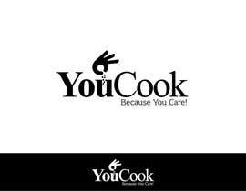
Our current logo is attached. We like the following:
- The name YouCook puts the focus on the customer and not the brand.
- The name celebrates the customer as a cook, i.e. the person who gets the credit for the great food (the personal touch)..
- The hand dropping spices into the pot puts further strengthens the above 2 points,
- Combined, the 2 elements sets YouCook apart from convenience products, such as TV dinners and take-away.
- The selling line "Because You Care": If you really care about providing good, varied, healthy and tasty food for you and your family, and about the environment, then home cooking is the right thing to do. People with a modern, busy, lifestyle are not able to live up to his on a daily basis. YouCook makes this possible for them.

What we don't like is simply that the overall look of the logo is not aesthetically pleasing. It seems disjointed, and does not form a self-contained unit. It is not refined. It lacks love! We are open to anything from fine-tuning to fundamental changes.

So the final result should include all the strong elements listed above, but turn it into a piece of art which we fall in love with. It can be in colour, but has to work in black & white. It has to work as a whole, but also without the selling line and even without the name (i.e. just the hand). The logo should be provided in all the file formats needed for web, print, and so on.

Recommended Skills

Employer Feedback

“chimizy showed a really great sense for aesthetics. The end result was very harmonious, which was exactly what I was looking for. ”

Profile image brianpetersen61, Denmark.

Public Clarification Board

  • philevangelisti
    philevangelisti
    • 8 years ago

    Ok. Just so you know . The best entries are submitted toward the end, because the smart designers don't want to be copied. I have a better entry, but didn't get a chance to submit. Most of these other entries are 20 minute jobs. Spent 4 hours on mine, haha owell. Good Luck!!

    • 8 years ago
  • brianpetersen61
    Contest Holder
    • 8 years ago

    Yes, the contest is over. I found a logo that I fell in love with. So I went for it. Thank you to everyone who has contributed.

    • 8 years ago
  • philevangelisti
    philevangelisti
    • 8 years ago

    Is the contest over? Or is there 18 hours left? The good ones are yet to come...

    • 8 years ago
  • titusdrake
    titusdrake
    • 8 years ago

    Hello! Please check #343, Sir.

    • 8 years ago
  • mrnuneznq8
    mrnuneznq8
    • 8 years ago

    Sir, can you give me some feedback on #326, so that I may hit the drawing board again?

    • 8 years ago
    1. mrnuneznq8
      mrnuneznq8
      • 8 years ago

      This would highly be appreciated!

      • 8 years ago
  • janhansen84
    janhansen84
    • 8 years ago

    Hej Brian Har lavet et indlæg med et par af min opgraderinger af dit logo
    vis du ku kommenter på det jeg hade lavet mvh. Jan

    #340

    • 8 years ago
  • mrnuneznq8
    mrnuneznq8
    • 8 years ago

    Good Day Sir, please see entry #326. Thanks!

    • 8 years ago
  • poojagupta786
    poojagupta786
    • 8 years ago

    Please check #267

    • 8 years ago
  • priya1412
    priya1412
    • 8 years ago

    #259 check plz.

    • 8 years ago
  • joeblackis17
    joeblackis17
    • 8 years ago

    #guaranteed

    • 8 years ago
  • Eng1
    Eng1
    • 8 years ago

    #246 please

    • 8 years ago
  • Eng1
    Eng1
    • 8 years ago

    please check#244 ,#245

    • 8 years ago
  • yousufbakshi
    yousufbakshi
    • 8 years ago

    #233 and #234 please

    • 8 years ago
  • yousufbakshi
    yousufbakshi
    • 8 years ago

    Hello please check #227 and feedback on it will be very appreciated. Thank you, Yousuf Bakshi

    • 8 years ago
  • brianpetersen61
    Contest Holder
    • 8 years ago

    Thank you very much for all the input. Unfortunately, most of it seems to be random variations on fonts and well-known graphic symbols, instead of the aesthetic approach , which the brief requested. The entry with 4 stars is the only one that seems to have worked with aesthetics in mind. But still not a significant improvement on current.

    • 8 years ago
    1. cherry0
      cherry0
      • 8 years ago

      WE ARE STILL UNABLE TO UNDERSTAND WHAT YOU REALLY WANT? you want the elements of your old logo ? or totally create a new one>?

      • 8 years ago
  • mamunfaruk
    mamunfaruk
    • 8 years ago

    #189, #192.

    • 8 years ago
  • adarshdk
    adarshdk
    • 8 years ago

    can i know what you are expecting in your design? cos the rejected entries contain both the modern as well as the classic ones.thank you

    • 8 years ago
  • didin578
    didin578
    • 8 years ago

    nifek yaw

    • 8 years ago
  • AlexCapp74
    AlexCapp74
    • 8 years ago

    Please check out entry #117. Thanks so much.

    • 8 years ago
  • agora906
    agora906
    • 8 years ago

    Wait for my entry please

    • 8 years ago
  • brianpetersen61
    Contest Holder
    • 8 years ago

    Not guaranteed. I don't know if I will get something that is better than what I already have. So I cannot guarantee payment for something that is not an improvement. On the other hand, I must have an improvement sooner or later. So I will continue until I can award the prize.

    • 8 years ago
    1. deztinyawaits
      deztinyawaits
      • 8 years ago

      To the CH, can I ask who made your logo? As I found this https://logopond.com/logos/e6a71aee08112a9e0ea2270c1b306843.png

      • 8 years ago
    2. Thejoshua
      Thejoshua
      • 8 years ago

      THIS IS FAKE BE CAREFUL, THIS IS A "TOO GOOD TO BE TRUTH" CONTEST

      • 8 years ago
  • mamunfaruk
    mamunfaruk
    • 8 years ago

    Have a look at #84, #87, #89. Thanks

    • 8 years ago
  • mamunfaruk
    mamunfaruk
    • 8 years ago

    #84.

    • 8 years ago
  • jerrijon26
    jerrijon26
    • 8 years ago

    at least provide some feedback before blindly rejecting the entries

    • 8 years ago
  • llewlyngrant
    llewlyngrant
    • 8 years ago

    Please check on # 55, #56. #57 and #58 Thank You

    • 8 years ago
  • motiurkhan513
    motiurkhan513
    • 8 years ago

    check#20......#26.......#29.......#31........thanks !

    • 8 years ago
  • sukoushaljain
    sukoushaljain
    • 8 years ago

    Please check #18 Thank you.

    • 8 years ago
  • deztinyawaits
    deztinyawaits
    • 8 years ago

    To the CH, can I ask who made your logo? As I found this https://logopond.com/logos/e6a71aee08112a9e0ea2270c1b306843.png

    • 8 years ago
  • currentdesignz
    currentdesignz
    • 8 years ago

    Hello Sir, i am going to submit a few entries for you to choose from :)

    • 8 years ago
  • pkdmvg
    pkdmvg
    • 8 years ago

    kindly see the refine design. Thanks

    • 8 years ago
  • ahmedjaved701
    ahmedjaved701
    • 8 years ago

    #guranteed

    • 8 years ago
  • DazzlerFreelance
    DazzlerFreelance
    • 8 years ago

    #guranteed

    • 8 years ago
  • cherry0
    cherry0
    • 8 years ago

    #guaranteed

    • 8 years ago
  • currentdesignz
    currentdesignz
    • 8 years ago

    Please make #guaranteed

    • 8 years ago

Show more comments

How to get started with contests

  • Post your contest

    Post Your Contest Quick and easy

  • Get tons of entries

    Get Tons of Entries From around the world

  • Award the best entry

    Award the best entry Download the files - Easy!

Post a Contest Now or Join us Today!