I need to create a logo, mobile app icon, and favicon for a finance/techie brand

  • Status: Closed
  • Prize: $70
  • Entries Received: 4
  • Winner: tarekrfahmy

Contest Brief

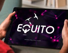
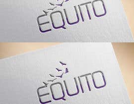
Creation of an ILLUSTRATIVE logo, together with mobile app icon, and favicon for the brand name ‘Equito' (or ‘EQUITO', or ‘equito').


Main colors - see uploaded palette:
Purple (RGB 124,65,120) and Grey (CMYK 1%, 2%, 0%, 36%)
OR
Purple (RGB 132,82,129) and Grey (CMYK 1%, 1%, 0%, 54%)

NOTE 1: Must be ILLUSTRATIVE.

NOTE 2: The KEY identity to convey first of all is CROWDFUNDING, and FINTECH (Finance and Technology).


Guidelines:

* This is an online crowdfunding business.
* The business is finance/techie
* The logo is about 'equity funding'
* The design should be ELEGANT and SERIOUS, but at the same time, LIGHT, DYNAMIC, and FLEXIBLE.
* The main message to convey is WEALTH, GROWTH, EXPANSION, and ‘BEING PART OF A GROUP'


Deliverables:

1. Logo creation
2. Mobile app icon design
3. Favicon or tab/URL icon
4. File formats to be produced should be .ai, eps, .pdf, .png, .psd, .svg, .tif, ,jpg, black and white , and transparent


NOTE: We may want to introduce an image as part of the logo. If you want to use one (instead of developing an abstract concept or image), these are some examples and suggestions:

1. Pack of birds taking off (symbolizing growth).
2. Coin, or a coin standing out in a pool of coins (symbolizing wealth).
3. One object standing out amongst others (symbolizing ‘part of a group’).
4. Tall building/s (symbolizing expansion).

Recommended Skills

Employer Feedback

“Tarek is a real professional. I highly recommend him as a senior resource for your projects!”

Profile image mdelp, Indonesia.

Top entries from this contest

View More Entries

Public Clarification Board

  • hashibul99
    hashibul99
    • 4 years ago

    i am working

    • 4 years ago
  • Abdelkrim1997
    Abdelkrim1997
    • 4 years ago

    Please check #269

    • 4 years ago
  • Abdelkrim1997
    Abdelkrim1997
    • 4 years ago

    PLease check #266

    • 4 years ago
  • vijaypawar61
    vijaypawar61
    • 4 years ago

    Please check my entry #255, Kind regards

    • 4 years ago
  • tarekrfahmy
    tarekrfahmy
    • 4 years ago

    Please check these entries #228 ,#229,#230, #231 , thank you

    • 4 years ago
  • vw8300158vw
    vw8300158vw
    • 4 years ago

    Working...

    • 4 years ago
  • tarekrfahmy
    tarekrfahmy
    • 4 years ago

    Please check #212 thank you

    • 4 years ago
  • najuislam535
    najuislam535
    • 4 years ago

    #191 byNaju I.

    • 4 years ago
    1. mdelp
      Contest Holder
      • 4 years ago

      This is not following the guidelines which we just mentioned. Sorry, we need to reject it.

      • 4 years ago
  • mdelp
    Contest Holder
    • 4 years ago

    We have shortlisted a few entries now and provided the necessary rating.

    We are heading towards the direction of wanting to have birds (as well) as part of the logo. If you are introducing it, please make sure that

    (1) they are outlines,
    (2) the flock of birds is in a ‘one to many’ formation, and
    (3) that it isdirecting left to right.

    Particular attention will be given to those design concepts which are able to introduce and/or merge the other elements/concepts defined in the project description into the design.

    • 4 years ago
  • tarekrfahmy
    tarekrfahmy
    • 4 years ago

    #189

    • 4 years ago
  • sobujaliraj2020
    sobujaliraj2020
    • 4 years ago

    sir, please check my entry #185 #186

    • 4 years ago
  • mdelp
    Contest Holder
    • 4 years ago

    For those who asked.. I have uploaded some compositions of flocks of birds as an idea for you to work on the name and perhaps the letter E to highlight it based on the other elements/concepts mentioned in the description.

    • 4 years ago
  • galvisangela
    galvisangela
    • 4 years ago

    Please check my entries #180,181 thanks

    • 4 years ago
  • najuislam535
    najuislam535
    • 4 years ago

    #182 byNaju I.

    • 4 years ago
  • tarekrfahmy
    tarekrfahmy
    • 4 years ago

    Please check #172 ,#173, thank you

    • 4 years ago
  • mdelp
    Contest Holder
    • 4 years ago

    Unfortunately this is not what I am looking for. All entries received so far, with the exception of 2, are more or less introducing a typographic-logo development plus an icon next to it. They are not really developing a visual for the brand concept and blend the logo/name into it. The logo should be more illustrative, and the name of secondary importance, although an integral part of it.

    • 4 years ago
    1. mdelp
      Contest Holder
      • 4 years ago

      It will help designers who only know how to copycat, yes. But I am not looking for those type of skills. We are evaluating the skills of a designers whom we will then hire for a full-blown brand identity project. Good luck!

      • 4 years ago
    2. mohammediqbalb
      mohammediqbalb
      • 4 years ago

      That sounds great. Oke i'll be back with new idea

      • 4 years ago
  • mdelp
    Contest Holder
    • 4 years ago

    We are going to go through an initial assessment. Please note that 90% of submissions will be rejected because they are not meeting the project description. Please read the requirements, as we don't want to waste anyone's time. Thank you

    • 4 years ago
    1. Mahfuz6530
      Mahfuz6530
      • 4 years ago

      #169

      • 4 years ago
  • mdismailkhan1995
    mdismailkhan1995
    • 4 years ago

    Sir,please check my entry #167#168

    • 4 years ago
  • azirasanyut
    azirasanyut
    • 4 years ago

    please check my entry and rate me #163 #162

    • 4 years ago
  • najuislam535
    najuislam535
    • 4 years ago

    #161 byNaju I.

    • 4 years ago
  • najuislam535
    najuislam535
    • 4 years ago

    #161 byNaju I.

    • 4 years ago
  • sobujaliraj2020
    sobujaliraj2020
    • 4 years ago

    sir, please check my entry #154

    • 4 years ago
  • sobujaliraj2020
    sobujaliraj2020
    • 4 years ago

    sir, please check my entry #152 #153

    • 4 years ago
  • najuislam535
    najuislam535
    • 4 years ago

    #135 byNaju I.

    • 4 years ago
  • mdelp
    Contest Holder
    • 4 years ago

    Guys, if I have to be honest, the designs are nice but a bit bland. Please read the description. "The KEY identity to convey first of all is CROWDFUNDING and FINTECH (Finance and Technology)". None of these designs convey this message straight away if you look at them. All the other components mentioned in the description (coins, money, birds, buildings, etc.) are only suggestions. It is HOW to place them that makes the difference.

    • 4 years ago
  • fahim366
    fahim366
    • 4 years ago

    Ok then i will try something with that

    • 4 years ago
  • juwelislam7257
    juwelislam7257
    • 4 years ago

    #69

    • 4 years ago
  • DesignExpertsBD
    DesignExpertsBD
    • 4 years ago

    Hello

    • 4 years ago

Show more comments

How to get started with contests

  • Post your contest

    Post Your Contest Quick and easy

  • Get tons of entries

    Get Tons of Entries From around the world

  • Award the best entry

    Award the best entry Download the files - Easy!

Post a Contest Now or Join us Today!