Freelancer: KumailNaqavi
Share:
Report Entry

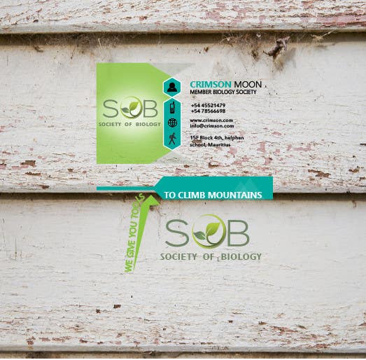
Deisgn 1A trasnparent and 2B with color.

I have given the greenish color of bio tried to make the logo still visible, a good design. at the back did some brain storming and added the tag line. the illustration at the back shows an arrow for going up which means success for students further more added the mountain illustration since you island has a famous volcano. I hope it becomes the desired bcard for you, if you like the design then tell me i shall make the letter head according to this design,
Contest Entry #93 for                                                 Design some Business Cards

Public Clarification Board

  • KumailNaqavi
    KumailNaqavi
    • 7 years ago

    hello thank you so much for selecting me as a winner, really appreciate it. However I am currently out of city and will not be able to handover you the design today. I will return back by tomorrow night and will complete the handover with the corrections you have asked.
    Thanks a lot. :)

    • 7 years ago
  • crimsonmoon
    Contest Holder
    • 7 years ago

    As a business card i would suggest u dont use a transparent one. Make it a normal business card. I like the colour but remove the we give you the tools to climb mountain bit.

    • 7 years ago
    1. KumailNaqavi
      KumailNaqavi
      • 7 years ago

      considered it removed... i attached the version 2B along with it so that you can see the difference. What else changes do you require in it?

      • 7 years ago